Summary
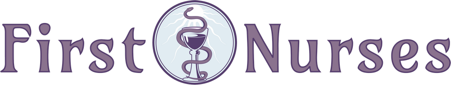
An explanation of the First Nurses logo

Our logo is a representation of qualities for which we are passionate.
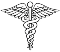

Asclepius
The ancient Greek myth of Asclepius tells that he was the ‘father of medicine’. The Hippocratic Oath, that doctors take as a rite of passage and devotion to ethics, until 1960, opened with the phrase “I swear by Apollo Healer, by Asclepius…”
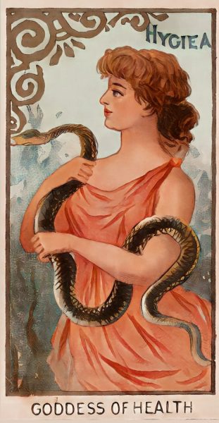
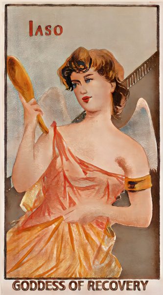
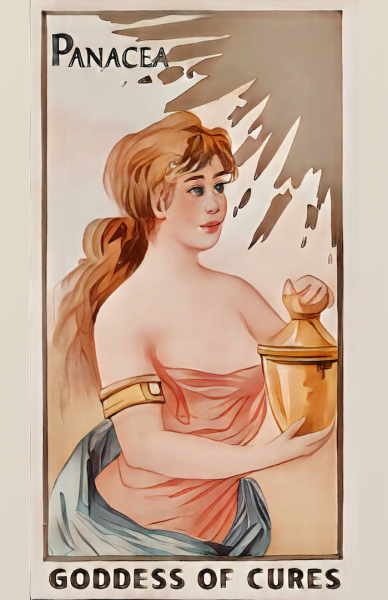
Our founder noted one evening when reading about these familiar logos, that Asclepius had several daughters, all of which represented aspects of nursing. You have probably heard the term ‘panacea’ used to refer to a cure-all. You are likely familiar with the term we use to describe cleanliness- ‘hygiene’. These were two of Asclepius’ daughters- Panacea and Hygiea. In some countries, pharmacies use the ‘bowl of Hygeia’ as their icon.
Daughters and Nurses
Because nurses AREN’T doctors, we felt that finding a visual representation of values we hold dear would best be represented by combining aspects of each of the daughters into one logo. Interestingly enough, that opening statement of the hippocratic Oath continues “I swear by Apollo Healer, by Asclepius, by Hygieia, by Panacea…”.
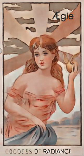
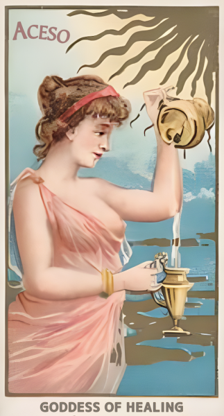
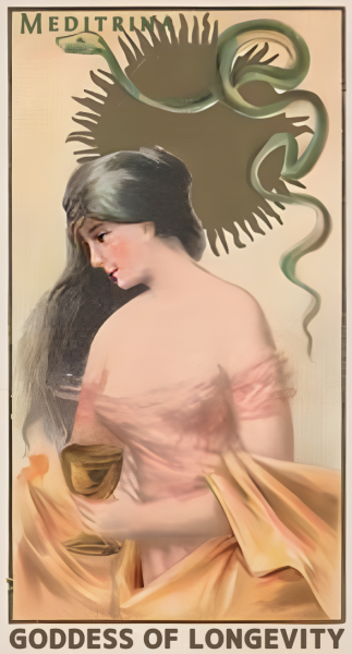
The images of these archetypes have been the subject of several of our social media posts. This explanation also points to why the name ‘First Nurses’ and our slogan “Integrity and Compassion Inspired by the First Nurses” were chosen.
The Daughters and What They Represent in Our Logo
glass reflection liquid sun rays blue purple
The snake hearkens to the rod of Asclepius.
Mythology exists, in part, to tell stories about issues that connect us in the human experience.
So you see, our logo IS strange. Ultimately, it’s about as weird as some of the other ancient symbols used to represent aspects of healthcare.
Weird or not, we really feel that it reflects the purpose of our organization.
(Images based on Trade cards from the “Goddesses of the Greeks and Romans” series (N188), issued in an unnumbered set of 50 cards in 1889 by W.S. Kimball & Co.)